Inline Editing Revamped
June 29, 2020
By Kendall Strautman
6 weeks ago, we embarked on a dedicated project with the goal of improving Inline Editing. We believe that this way of creating content is the future, and we want to be a driver in actualizing that future.
We chose to specifically focus on Inline Blocks, to hone in on the page builder capacities of Tina. What follows are some improvements and changes made within react-tinacms-inline, along with process notes gathered throughout the course of this project:
Aesthetics
Focus Ring
With inline editing, focus behavior greatly impacts the editing experience. It should fluidly shift from active to quiet based on user input, communicating editing state and fostering a sense of control. The feedback loop needs to be tight, without being overbearing. The UI needs to be clear and yet subtle; it should not eclipse the content.
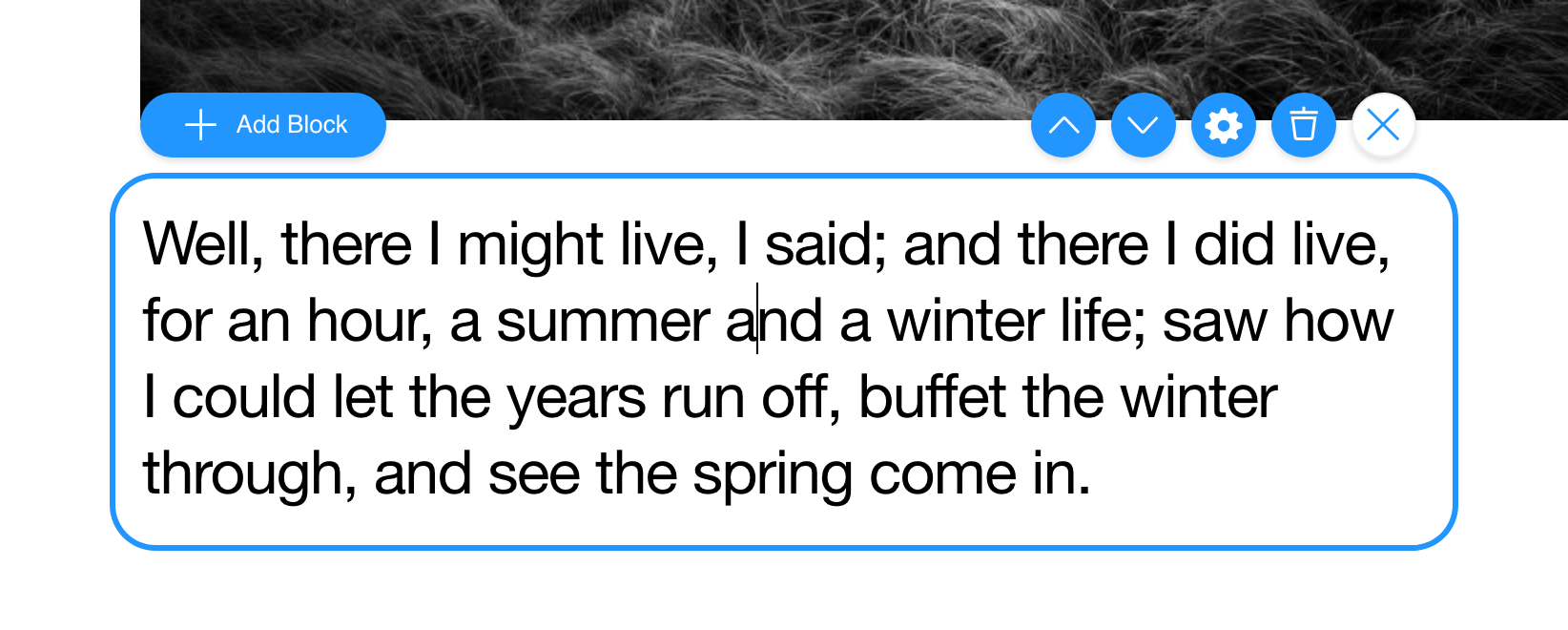
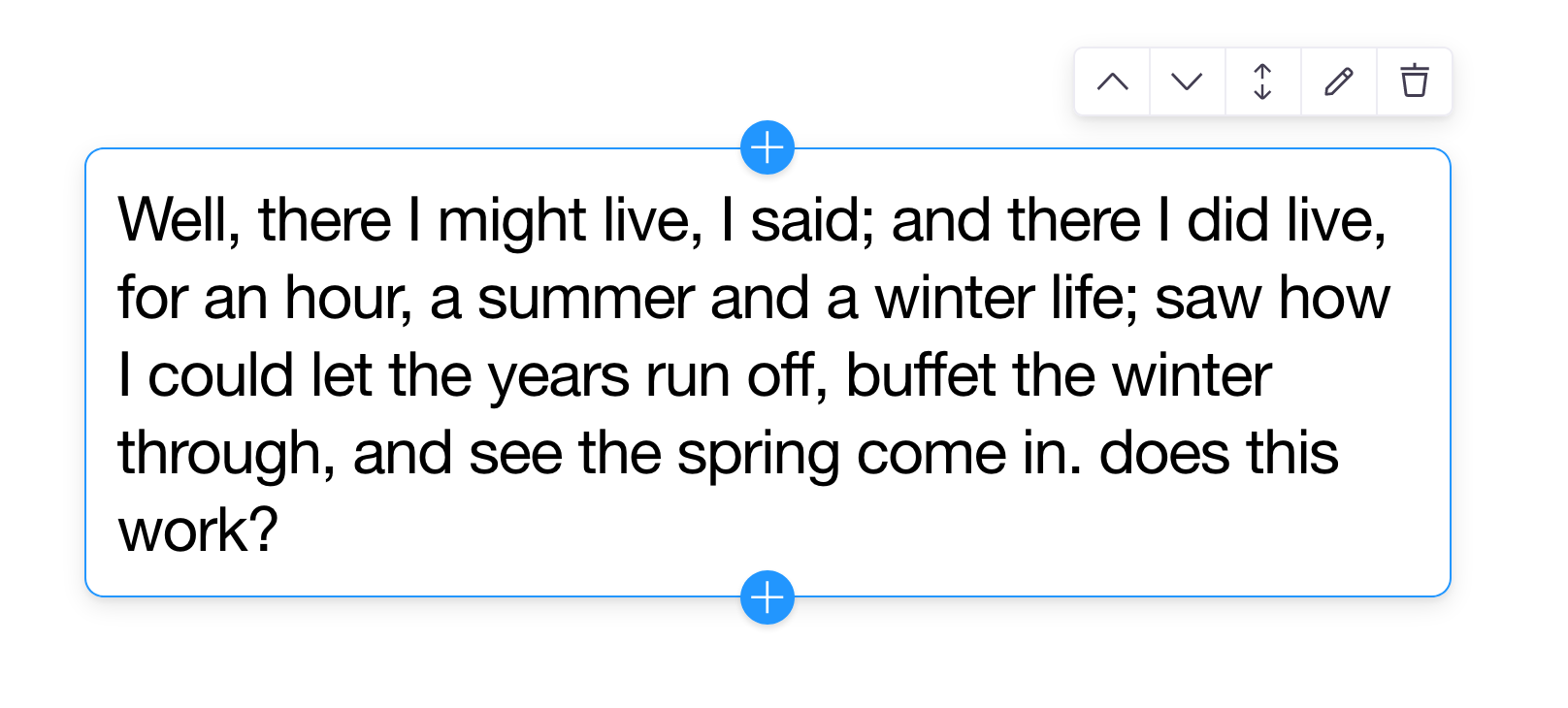
With this understanding, we chose to make the visual focus indication more nuanced — taking the stroke to 1px and incorporating a subtle drop shadow. This design helps differentiate an active block from the background while minimizing distraction from the content.
 Before
 After
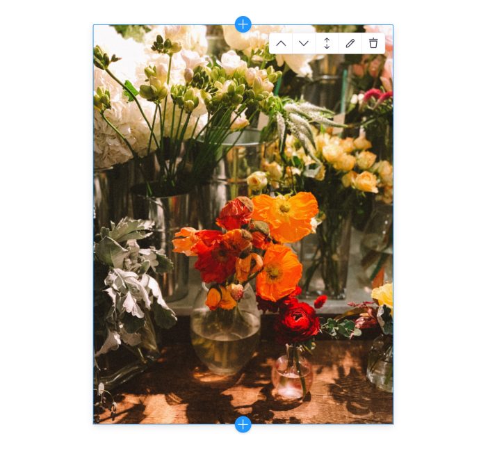
After
Controls UI
With the inline editing controls, our instinct sought to tone down visual weight and improve functional clarity. This materialized by unifying the controls into a single panel, neutralizing the color palette, updating icons, and an incorporating an elegant drop-shadow.
The 'Add Block' interface shifted as well. Given the importance of this action, we opted to isolate it from the other controls and simplify the label into a 'plus' icon. Editors can now add blocks before or after their siblings and set the direction on a horizontal or vertical axis.
UI Customization
We wanted to not only clean up the visual aesthetic of the focus ring, but also to surface more customization opportunities for the developer.
Styles & Position
When building blocks-based layouts, we noticed that page-width blocks might cause the focus ring and controls to bleed off the screen. This is due to the default offset between the focus ring and the block element.
We surfaced the ability to precisely control the amount of this offset by passing 'x' and 'y' values to the focus ring configuration. And we provided an insetControls prop that will tuck the group or block controls within the upper corner of the element.

Developers can also control the border radius of the ring — to allow for focus rings that are fully flush with the content or even for circular blocks.
Block Limits
As we made side projects to test these editing features, we wanted the ability to limit the block range. These min / max numbers can be set on the Inline Blocks. When the minimum is reached, blocks can no longer be deleted, and likewise when the maximum is reached, additional blocks cannot be added.
This feature allows designers & developers to craft flexible layouts for editors while employing guardrails to uphold their design.
Editing
Drag & Drop Reordering
In doing research around other inline editing interfaces, a feature that wasn't common but stood out to us was the ability to reorder via dragging blocks. Leaning on react-beautiful-dnd, editors can drag blocks on either horizontal or vertical axes to adjust their order.
We chose to place the drag handle directly in the controls UI to minimize interference with inputs. The overall result is a simple opt-in feature that further elevates the interactive editing context.
Nested Blocks Focus
Something that was important to us was supporting nested blocks well — meaning blocks can render other blocks without the controls and focus states conflicting.
One issue we quickly noticed with nested blocks was overpopulated focus rings. When hovering over fields and fields, numerous focus rings might display at the same time — to indicate both the block and the field within the block have potential active states. To mitigate this, all inline fields now accept a focusRing boolean to denote whether to show the focus ring at all. This provides greater control over focus clutter.
We also improved the focus logic to mitigate parent / child conflicts. Now, when you click on any block area, the parent block is selected first. When the parent block is active, the child blocks can then be focused on. This sequential focus helps the user know what is available to edit at various block levels. Moving up the chain involves clicking on the parent block area again.
Fields
New Inline Group Field
Before this field was introduced, the only way to edit metadata in the Settings Modal was through a block. This field provides an opportunity to add blocks-like controls and a focus ring to a group of regular inline fields.
Inline Groups can be helpful for regular inline fields where you need to edit metadata. Take a single inline image for example — you could wrap this field in an Inline Group to expose a form for the alt tag and other image data.
Inline Groups are also a great way to organize numerous inline fields into cohesive chunks when you don't need to add, delete or reorder children.
General Improvements
Settings Modal
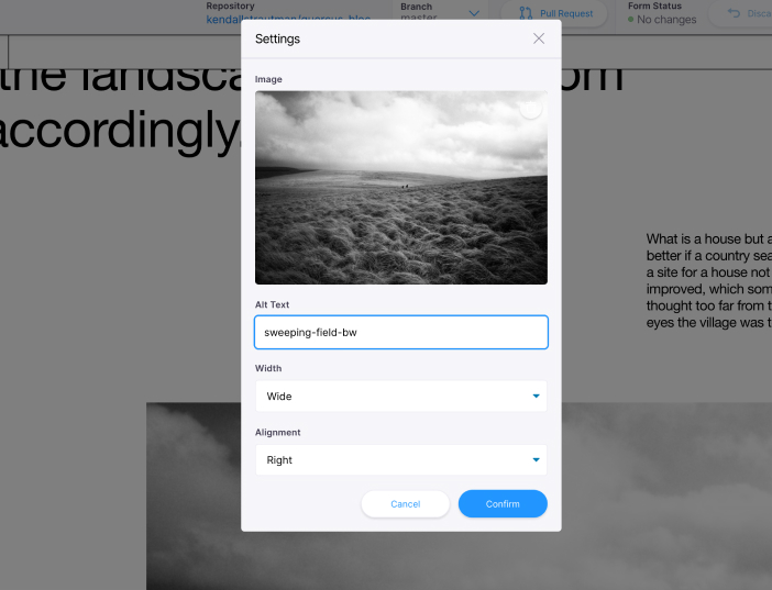
One glaring UX issue we noticed was the Settings Modal action UX. Initially, there was only a cancel and 'exit' button, which effectively did the same thing — closed the modal.
We introduced a confirm button and adjusted the functionality of the cancel button so it actually resets form changes. This clarity for editors to better control and implement changes to the settings form.

Enabling edit mode through the CMS
During the course of this project, the ability to enabled or disable the CMS entirely was introduced to the project. With this feature, we can now control Inline Editing Mode through this enabled flag. When the CMS is enabled, the inline editing state is automatically active.
This simplifies inline editing configuration. Developers no longer need to make a separate 'Enable Edit Mode' toggle to engage that active editing state. They can control whether the CMS is enabled throughout their entire project at the App level.
Final Thoughts
We know this is just the beginning. We are very passionate about the inline editing experience and will work to continually improve this API.
We want to give developers the freedom to build fully custom page-builder type workflows. While we have some ideas already on how to take this further, we'd love to hear your feedback! Feel free to reach out with ideas on Twitter, or in the Forum.
To dive deeper, please read this guide to get more familiar with the technical implementation of these new features. Or play around with the simple demo made from the guide to get inspired!