Radio Group Field
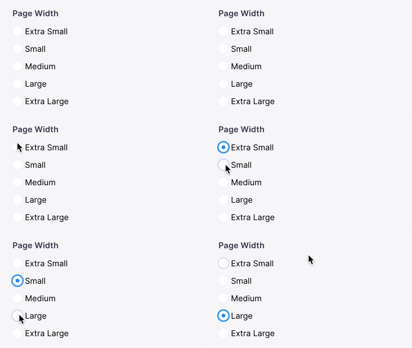
The radio-group field represents a group of radio inputs. There are two variants that can be used, "radio" and "button", and can rendered in a "horizontal" or "vertical" direction. The "radio" variant in a "horizontal" direction is used by default.

The "radio" variant can be rendered in a vertical direction like so.

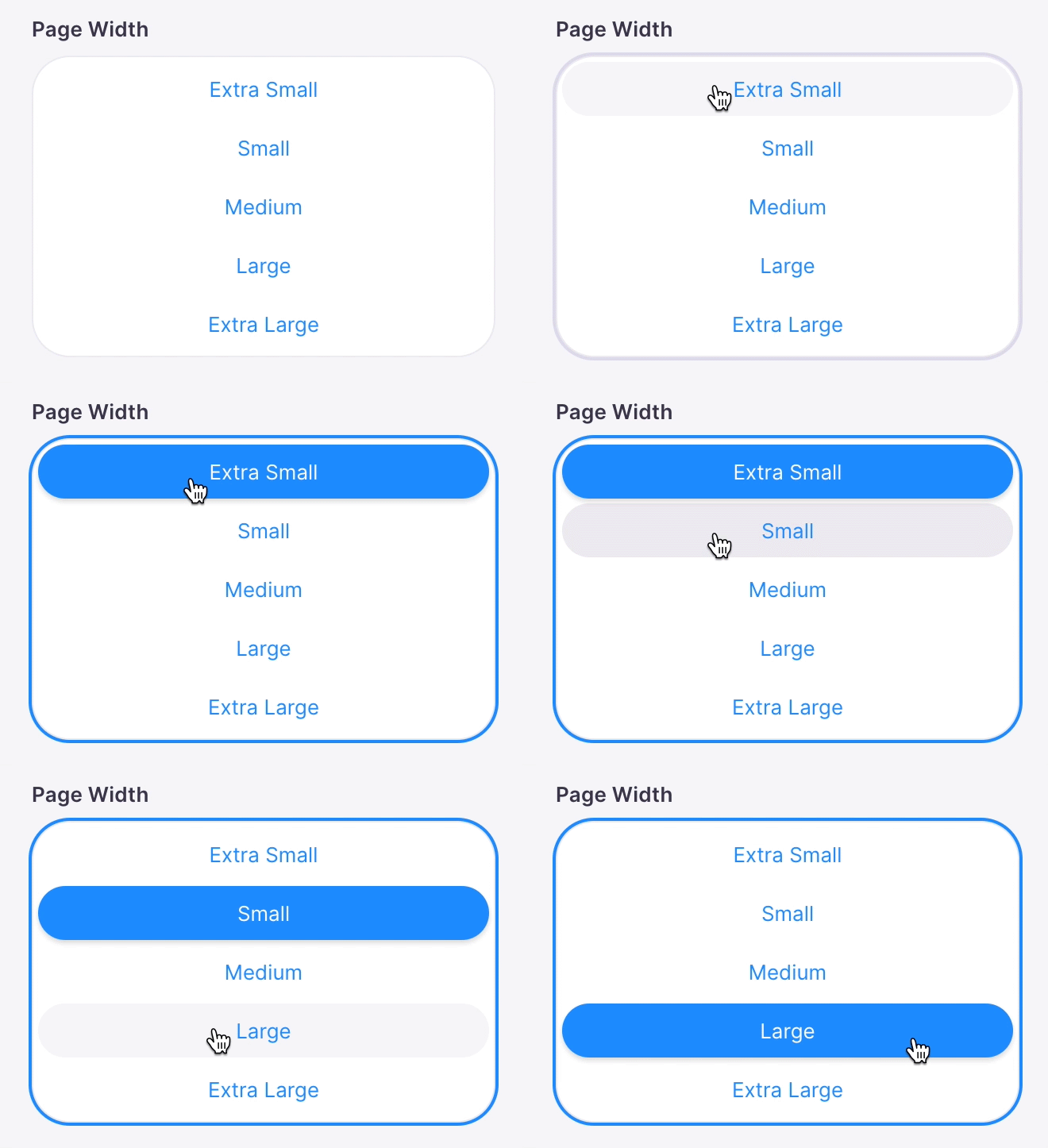
This is what the radio group "button" variant will look like.

The "button" variant can also have a "vertical" direction as well.

Options
| Option | Description |
|---|---|
component | The name of the plugin component. Always 'radio-group'. |
name | The path to some value in the data being edited. |
options | An array of strings or Options to select from. |
direction | An optional string indicating whether to render the radios in a "horizontal" or "vertical" orientation. This will default to "horizontal" if no value is passed. (Optional) |
variant | An optional string indicating whether the "radio" or "button" variant should be used. This will default to "radio" if no value is passed. (Optional) |
label | A human readable label for the field. Defaults to the name. (Optional) |
description | Description that expands on the purpose of the field or prompts a specific action. (Optional) |
interface RadioGroupField {
  name: string
  component: string
  label?: string
  description?: string
  options: (Option | string)[]
  direction?: 'horizontal' | 'vertical'
  variant?: 'radio' | 'button'
}

type Option = {
  value: string
  label: string
}
These interfaces only show the keys unique to the radio group field.
Visit the Field Config docs for a complete list of options.
Example #1: Select an Rating
Below is an example of how a radio group field could be used to choose a rating of a customer review.
const ReviewForm = {
  fields: [
    {
      component: 'radio-group',
      direction: 'vertical',
      name: 'frontmatter.rating',
      label: 'Rating',
      description: 'Choose a rating for this review',
      options: [
        { label: '★', value: 'one_star' },
        { label: '★★', value: 'two_star' },
        { label: '★★★', value: 'three_star' },
        { label: '★★★★', value: 'four_star' },
        { label: '★★★★★', value: 'five_star' },
      ],
    },
    // ...
  ],
}
Example #2: Choose an Amount of Padding
Below is an example of how a radio group field could be used to set the amount of padding for a section on a page.
const SectionForm = {
  fields: [
    {
      component: 'radio-group',
      variant: 'button',
      name: 'padding',
      label: 'Padding',
      description: 'Choose the amount of padding for this section',
      options: [
        { label: 'XS', value: 'xs' },
        { label: 'SM', value: 'sm' },
        { label: 'MD', value: 'md' },
        { label: 'LG', value: 'lg' },
        { label: 'XL', value: 'xl' },
      ],
    },
    // ...
  ],
}